Optimized Claim Process for a 197% Uptick
Designing a seamless and straight-forward health claim submissions.
Problem
Manulife's Group Benefits App was complex and confusing. Submitting a Health Claim was one of the main features, but it was filled with usability problems, resulting in complaints and poor app reviews.
Impact
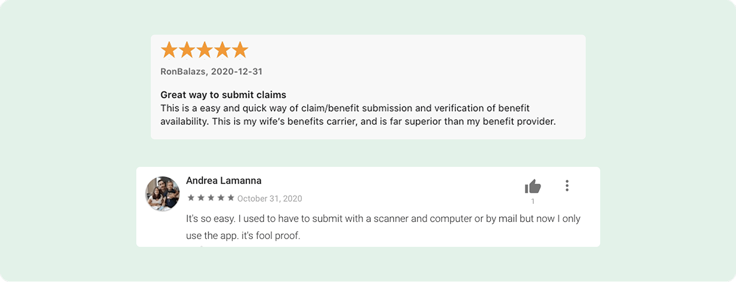
My role was to conduct the research and design for the iOS and Android apps. We restructured and simplified the 'Submit a Claim' feature so the flow was consistent between all claim types, and actions were crystal clear to users. The redesign led to a 53% increase YoY in traffic and a 197% increase in claims made on the app, and our app rating increased from 1.7 to 4.2 stars on Android, and from 2.2 to 4.4 stars on iOS.
Identifying Usability Issues
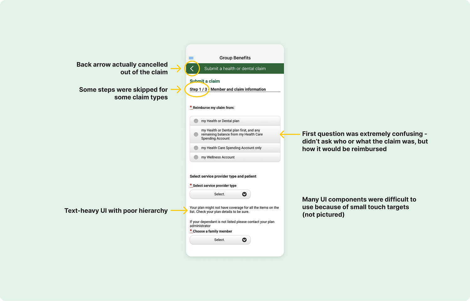
The 'Submit a Claim' flow had glaring usability issues and needed to be rebuilt for each of the six claim types. We created a new claim flow that improved the usability, and reused the same components for all of the types health and dental claims.
I reviewed the old flow to identify the key problems. There was a laundry list of visual and usability issues that needed to be addressed.
Stakeholder Workshop
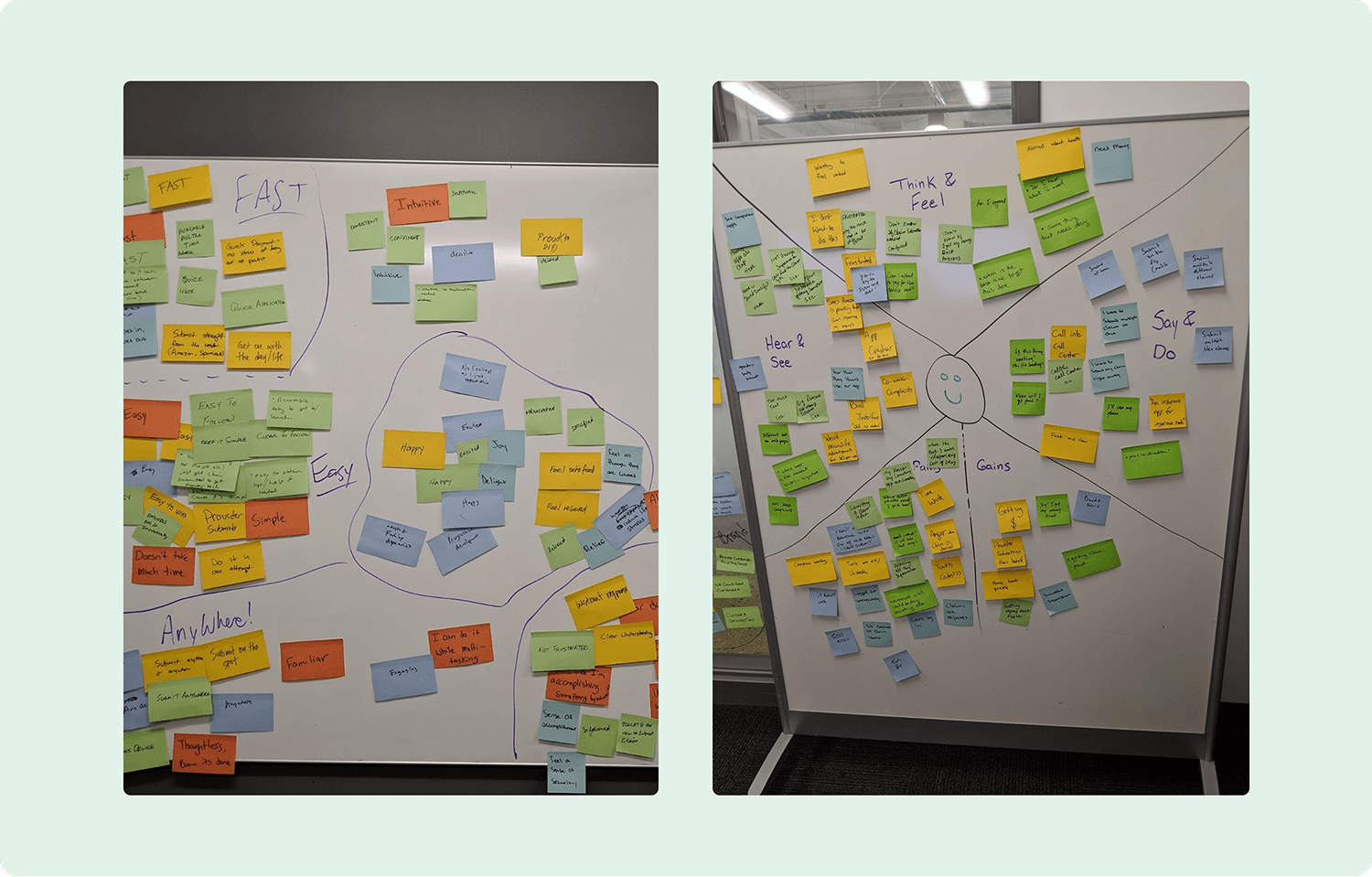
To address these issues and get business alignment, I organized a two-day design workshop with our business stakeholders. We delved into understanding our target persona, mapped the user journey, and consulted experts from various teams, including the call centre, claims processing, and UX research. This collaborative effort led to identifying key areas for improvement: preventing errors, enhancing ease of use, and simplifying language.
The Redesign
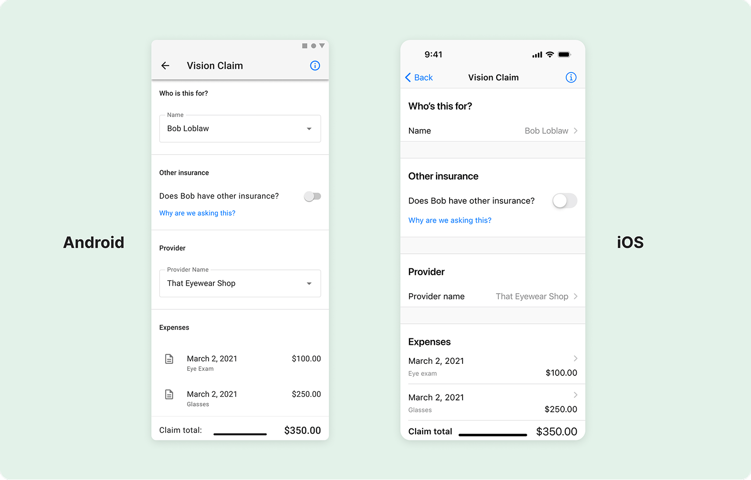
The redesign process involved extensive trial and error. I created various designs and conducted quick, iterative usability tests to ensure intuitive navigation. As the form evolved, we shifted to more in-depth testing to ensure alignment with the targeted user experience from outlined in the stakeholder design sessions.
Flow Restructure
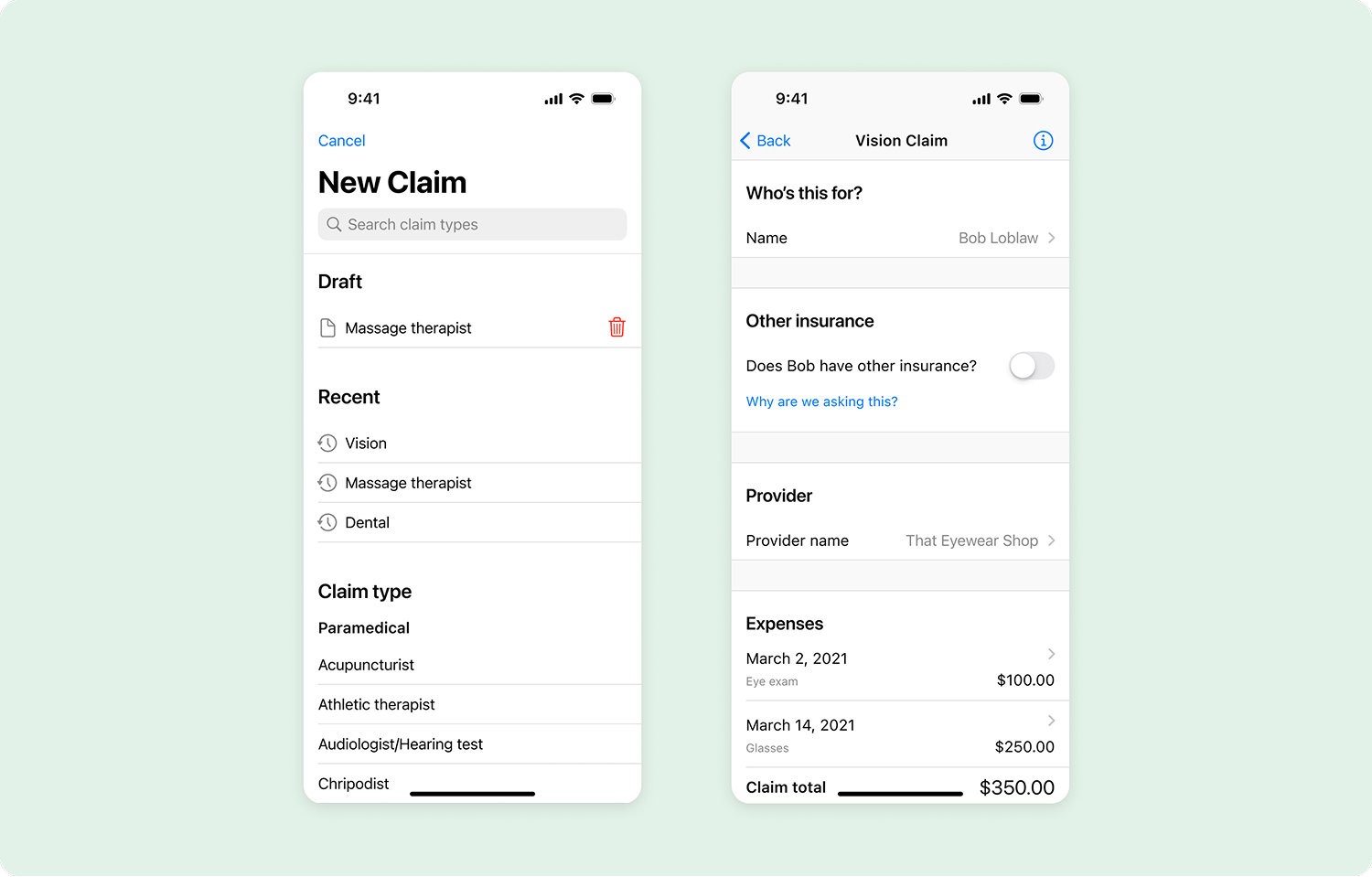
In the new flow, we eliminated the concept of "steps" since not all steps were relevant for every claim. Instead, I designed a single-page form that grouped questions into related sections following a "who, what, where" pattern, concluding with the reimbursement question. Simple sections remained on the form, while more complex ones, like adding expenses, redirected users to a new page.
Introduction of a Review Step
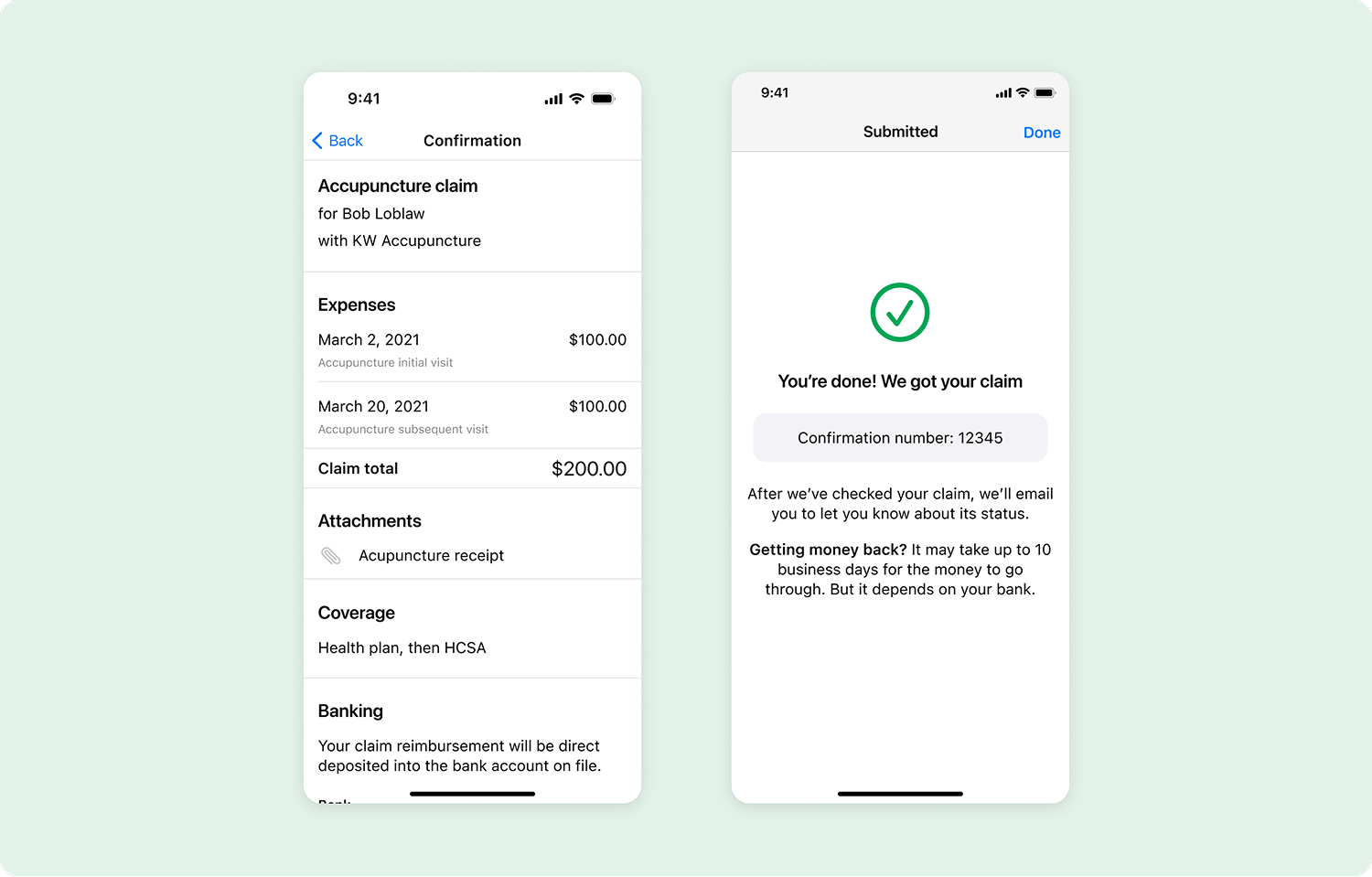
A confirmation page was introduced so users would review their information before submitting. This was both a usability and a business win; the confirmation page made it easy for users to spot mistakes, which resulted in more accurate claims. The confirmation page also served as a convenient location for banking information and mandatory terms and conditions acceptance for legal compliance.
Language Simplification
Our redesign prioritized simplicity, aiming to make actions self-evident without the need for explanatory text. We achieved this through two methods: UI changes and label adjustments. UI changes focused on refining the visual structure to convey meaning, reducing the need for explanatory text. Label adjustments aimed to shorten and clarify copy while maintaining accuracy, which was particularly crucial for accommodating French-speaking users, given Manulife's bilingual presence in Canada.
Wrap Up
Ultimately, the redesign resulted in a 53% increase in traffic YoY and a remarkable 197% increase in claims made through the app. On Android, our app rating increased from 1.8 to 4.2 stars, and on iOS it increased from 2.4 to 4.4 stars. This transformation not only enhanced our app's reputation but also served as a compelling feature to attract new clients to Manulife.